
The Psychology of Color in Web Design
Color is an essential aspect of web design. It can affect users’ perceptions, emotions, and actions on a website. Understanding the psychology of color in web design can help designers create websites that are more effective in achieving their goals. In this blog post, we will explore the psychology of color in web design and how it can impact user behavior.
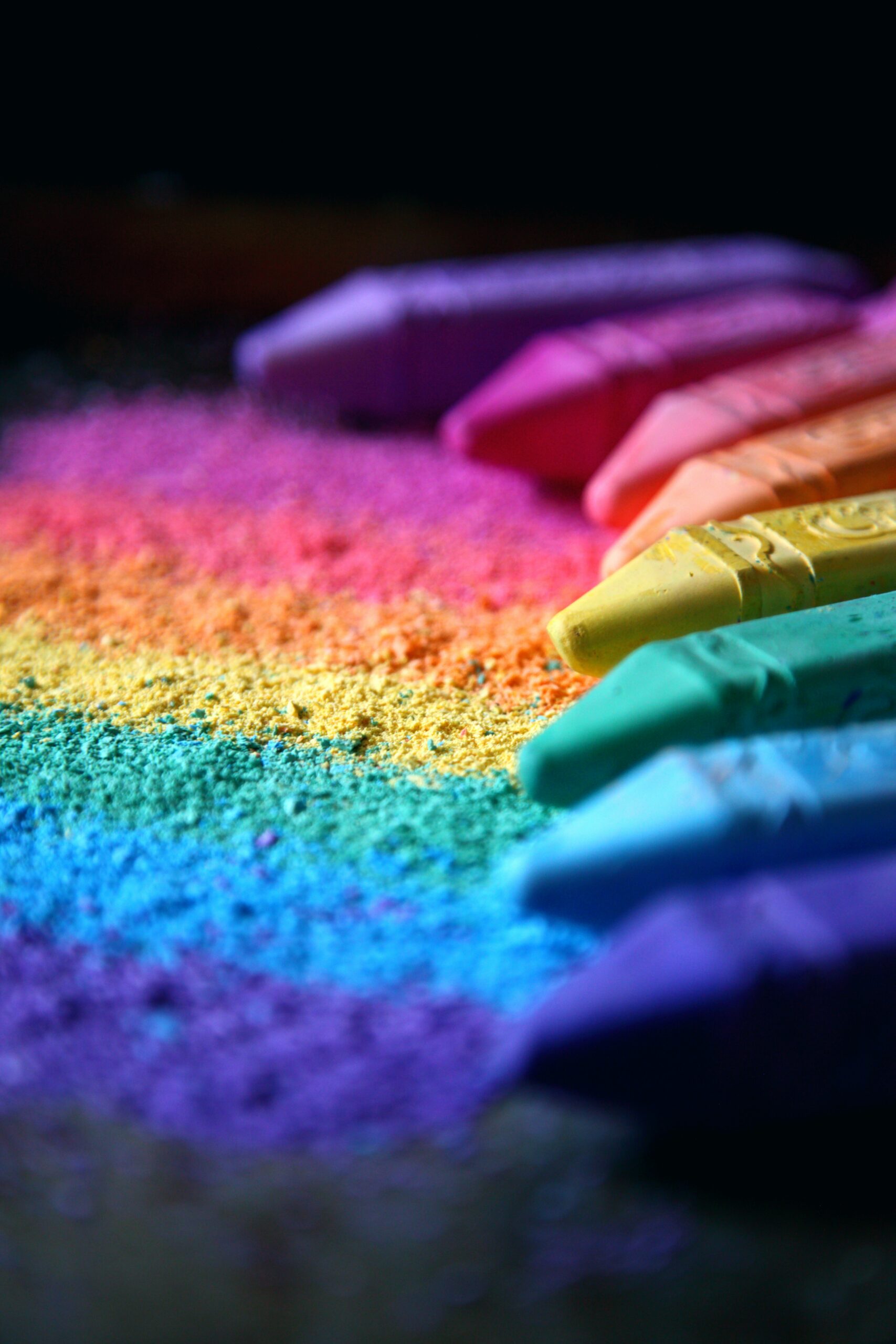
Red
Red is a powerful color that evokes strong emotions. It is often associated with passion, love, and excitement. In web design, red is commonly used to draw attention to important elements such as call-to-action buttons. However, overuse of red can be overwhelming and make users feel stressed or anxious.
Blue
Blue is a calming and soothing color. It is often associated with trust, reliability, and professionalism. In web design, blue is commonly used by businesses to establish a sense of security and credibility. However, overuse of blue can make a website feel cold and impersonal.
Yellow
Yellow is a cheerful and optimistic color. It is often associated with happiness, warmth, and friendliness. In web design, yellow is commonly used to grab attention and create a sense of urgency. However, overuse of yellow can make a website feel too bright and overwhelming.
Green
Green is a natural and calming color. It is often associated with growth, harmony, and balance. In web design, green is commonly used to convey a sense of health and environmental friendliness. However, overuse of green can make a website feel too earthy and dull.
Orange
Orange is a warm and energetic color. It is often associated with enthusiasm, creativity, and excitement. In web design, orange is commonly used to create a sense of urgency and to draw attention to important elements. However, overuse of orange can make a website feel too loud and obnoxious.
Purple
Purple is a luxurious and mysterious color. It is often associated with creativity, elegance, and sophistication. In web design, purple is commonly used to convey a sense of luxury and exclusivity. However, overuse of purple can make a website feel too dark and moody.
Black
Black is a powerful and sophisticated color. It is often associated with luxury, elegance, and sophistication. In web design, black is commonly used to create a sense of sophistication and class. However, overuse of black can make a website feel too dark and gloomy.
White
White is a clean and simple color. It is often associated with purity, cleanliness, and simplicity. In web design, white is commonly used to create a sense of minimalism and sophistication. However, overuse of white can make a website feel too plain and uninteresting.
Conclusion:
In conclusion, the psychology of color is an essential aspect of web design. Understanding how colors can impact users’ perceptions, emotions, and actions can help designers create websites that are more effective in achieving their goals. However, it is important to remember that different people have different cultural and personal associations with colors, and what works for one audience may not work for another. Ultimately, the decision to use a particular color scheme should be based on the needs of the website and its users.